| Consumer Metrics Institute News Feed Subscribe to Consumer Metrics Institute News by Email |
Consumer Metrics InstituteTM
Home of Daily Consumer Leading Indicators
| Consumer Metrics InstituteTMHome of Daily Consumer Leading Indicators |
| Home | History | Automotive | Entertainment | Financial | Health | Household | Housing | Recreation | Retail | Technology | Travel | FAQs | Downloads | Membership | Contact | About |
 | August 30, 2011 - Has the BEA Already Documented the Second Dip?: During the past several quarters we have been persistently critical of the "deflaters" that the Bureau of Economic Analysis (BEA) has used to convert their "nominal" (current dollars) GDP data into inflation-adjusted "real" (chained 2005 dollars) data. Quite apart from our concerns about the accuracy and delays in their "nominal" data, we have often found their "deflaters" lacking credibility -- and in some cases egregiously so. And recently we have suggested that the entire reported annualized growth rates were merely artifacts of overly optimistic understatements of the actual inflation rates in the US. Furthermore, major portions of the BEA's recent massive downgrades to historical GDP growth rates were the result of restating historical "deflaters" to levels more consistent with the inflation data previously recorded by their sister agencies, constituting a tacit admission of their past tendencies to just such understatements of historical inflation. Over the past weekend Mike Shedlock ("Mish") asked us to put those assertions into some more substantial form. Meanwhile Doug Short has also been tracking this phenomenon, and he has been charting the BEA data using several different alternate "deflaters" in his commentary. The logic of "deflaters" is simple: as you might expect the BEA can only capture production and consumption data in current ("nominal") dollars, which are distorted over time by the impact of price inflation. To offset that distortion the BEA uses a set of price-indexes to "deflate" the "nominal" GDP into a "real" GDP that is then reported in "chained 2005 dollars" (i.e., all distortions caused by price changes since 2005 are in theory removed from the data before the "real" economic growth is reported). The Tables The BEA goes to great lengths to report the data both ways, and provides detailed spreadsheets that can be downloaded by the curious: the "nominal" data can be downloaded in Table 1.5.5 and the "real" data can be found in Table 1.5.6. Note that although each column in the tables represents a different quarter, the numbers in those columns are "annualized" (i.e., 4 times the actual quarterly tallies). Similarly the growth rates reported by the BEA in Table 1.5.2 are "annualized" (i.e., the quarter-to-quarter rates of change are projected out for a full year). By using the information in the the BEA's tables it is relatively simple to "reverse-engineer" the actual "deflaters" that they have used to convert from their "nominal" numbers to their purported "real" numbers. The following table shows the BEA's reported "nominal" and "real" annualized GDP for the past 10 quarters, along with the reported "real" growth rate and the "deflater" used by the BEA to convert from the "nominal" to the "real" numbers (most recent quarter on the left): BEA's Quarterly GDP Past 10 Quarters
The Problem Focusing for the moment on the bottom line in the above table, the BEA's "deflaters" tell us that they believe that inflation over the prior two quarters has been running at annualized rates of 2.51% and 2.72% respectively -- and the annualized inflation rate for the prior four quarters was just barely over 2%. Think about that for a moment. Is it remotely plausible that the 12 months ending this past June saw net inflation just barely over 2%? Even if they have accurately captured the "nominal" data for those two quarters (which requires a major leap of faith in its own right), the "real" numbers should strain credibility every bit as much as the purported inflation rates. However, the BEA is not the U.S. Federal Government's primary source for inflation data. That honor falls to the Bureau of Labor Statistics (BLS) within the United State Department of Labor. If we presume for the moment that the BLS's reading of inflation rates is at least as authoritative for "deflaters" as the BEA, we can piece together credible alternative GDP growth rates using the "nominal" data from the BEA and calculate the "real" data using "deflaters" derived from the BLS's unadjusted CPI-U (CUUR0000SA0) consumer price index table and their unadjusted PPI (WPUSOP3000) producer price index table. When we recast the GDP growth rates using the BLS sourced deflaters we can build the following table showing the past 10 quarters of growth in "nominal" GDP, "real" GDP using the CPI or PPI tables (as appropriate for each individual GDP line item), the per-capita "real" GDP similarly calculated and the per-capita "real" disposable income (again most recent quarter on the left): Annualized GDP Growth Rates Past 10 Quarters
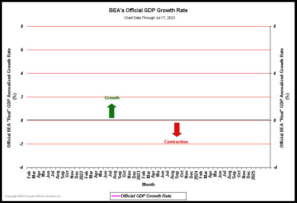
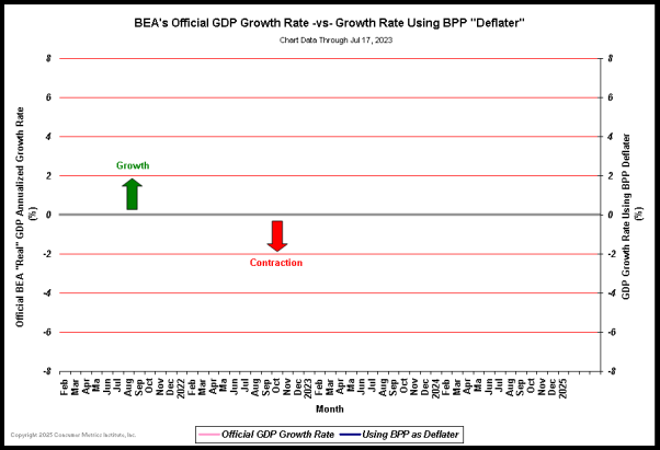
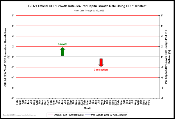
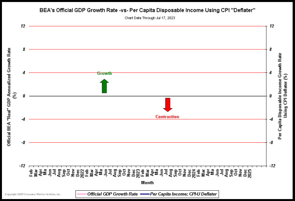
The Charts Charting the past four years of GDP data shows some glaring differences between the BEA's official version of U.S. economic growth and BLS price index "deflated" versions of the same "nominal" data. First the BEA's official version of annualized "real" GDP growth rates:  (Click on chart for fuller resolution) Now compare that official growth rate with the annualized growth rates derived using the BLS CPI-U or PPI (as appropriate for the parts of the economy being measured):  (Click on chart for fuller resolution) A glance at the above chart reveals several startling changes from the "official" version of U.S. economic growth. At least two alternative readings of economy history can be pulled from the graph: -- First and foremost, on the right hand end of the chart the past two quarters have been in contraction -- meeting the clinical definition of a new recession. According to this chart the second dip has already happened. -- On a more academic note, in the left half of the chart the shape of the first "dip" is now shown to be substantially different than we had been led to believe -- but perhaps not all that different from what "Main Street" consumers sensed at the time. Just as increasing prices can stifle economic growth, decreasing commodity prices can stimulate demand for discretionary goods. The rebound in consumer demand that we witnessed here at the Consumer Metrics Institute at the end of the fourth quarter of 2008 was the consequence of rapidly deflating energy prices -- and the highly prominent upward one-quarter "blip" in the recalculated "real" GDP is a sign (or perhaps an artifact) of the 2008 crash in gas prices. Consumers clearly felt the change in purchasing power that is visible in this chart and responded in ways that were captured in our nearly real-time indexes. All of this began to happen a full quarter before the financial markets bottomed in early March 2009. That surge of economic activity, however, was completely missed by the BEA because of the inertia in their deflaters. The 4Q-2008 upward "blip" was very short-lived and the subsequent contraction was much longer than the "official" record would indicate. Is the 4Q-2008 upward "blip" the trigger for the subsequent recovery or an anomaly in the data? The best answer is probably both. The surge was a transient effect of lowering energy prices that could not by itself sustain the entire economy. But it provided those consumers who still had steady jobs a significant increase in disposable discretionary funds, which they used to then create surprisingly good holiday sales. It at least confirms one of our themes here: the "Great Recession" was more complex than generally credited and evolved dynamically at the consumer level in ways that the BEA simply failed to notice. Standard of Living The first and primary metric for the economic health of a citizenry is their per-capita GDP. It is the way that we rank other nations, distinguishing between Norway, Switzerland and Qatar on the one hand and Uganda, Ethiopia and Zimbabwe on the other. It is the measure by which we separate truly first-tier "developed" economies from those in the third world. Our data at the Consumer Metrics Institute is intrinsically per-capita as a consequence of our "same-shopper" methodologies. Doug Short has championed converting the GDP data to a similar basis. If we chart the per-capita equivalent of the above data we see that the "real" line shifts down slightly, as a result of some portion of the economic growth being actually the normal result of demographics and a growing population:  (Click on chart for fuller resolution) If we judge Zimbabwe by its per-capita GDP, why does the BEA generally not report U.S. growth with the same metric? The answer is simple: the headline numbers would appear less favorable. Which leads one to wonder just how politicized the agency might be. Incomes If this economy will no longer be buoyed by Federal fiscal madness or Federal Reserve monetary experiments, then increasing consumer spending will need to be the engine of economic growth. In that light the last line in the above table is the most critical: the "real" growth in per-capita disposable income. A chart of the last four years of BEA recorded "nominal" per-capita disposable income deflated by the BLS's CPI-U looks something like this:  (Click on chart for fuller resolution) Even this chart shows a "real" second dip, this time in contracting disposable income. Consumers react to changes in income with a slight lag, typically from one to three months. We would expect the second dip to work its way through the supply chain to the factories during the rest of the third quarter and perhaps through the middle of 4Q-2011. The disposable income graph also shows that incomes dropped later and recovered sooner than the overall economy, again highlighting our theme that the "Great Recession" had a very different character for consumers than anything that the BEA has reported. For this reason the disposable income chart above (along with the alternately deflated GDP and per-capita GDP charts) will be permanently featured on the History page at our website. The Bad News The bad news is that all of the recalculated GDP growth rates show a 1Q-2011 that is far more abysmal than is commonly recognized. But we suspect that the consumers that we track knew this all along: their demand for discretionary durable goods plummeted during that time span and bottomed in late May. The good news, however, is that the last quarter shown in the three charts immediately above shows moderation in the contraction rate -- again consistent with what we are now seeing in our indexes, given a one to three month lag in consumer response times. Our bottom line is that the "real" economy has been worse than previously reported, and the full impact of that lethargy has yet to be felt at the factory level. But the good news is that deflating commodity prices (e.g., gasoline) can have a remarkable and sudden impact on the economy. Let's hope that ongoing relief at the gas pump will soon spread to the rest of the economy. | ||||||||||||||||||||||||||||||||||||||||||||||||||||||||||||||||||||||||||||||||||||||||||||||||||||||||||||||||||||||||||